
Outside the Box
Branding | Website | Usability Testing
Overview
Outside the Box showcases artists, local art supply shops, and underground high-quality art supplies, all while motivating and encouraging artists to create through quarterly art supply subscription boxes and creative prompts.
Prompt
Create branding and a website for a local art supply shop to expand its customer base while offering an innovative art supply subscription box service.
Logo
The Outside the Box logo uses the simplicity of shapes to communicate the potential for creative ideas. The subtle crayon texture along the edges brings in a satisfying handcrafted feel to the brand. Used on the website, the intention is to make the interface look less like a screen and more like a canvas scattered with possibilities.
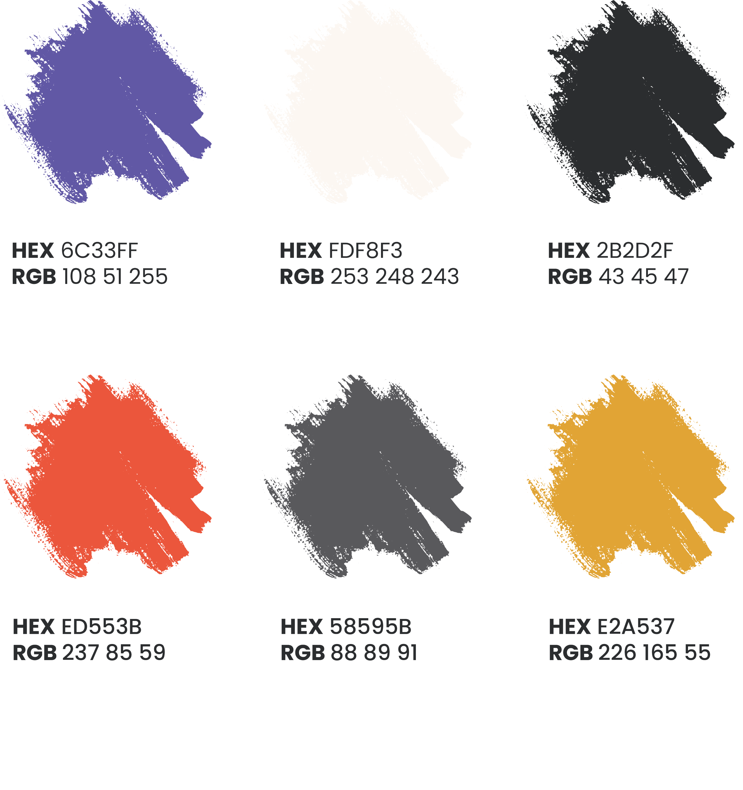
Typography & Color

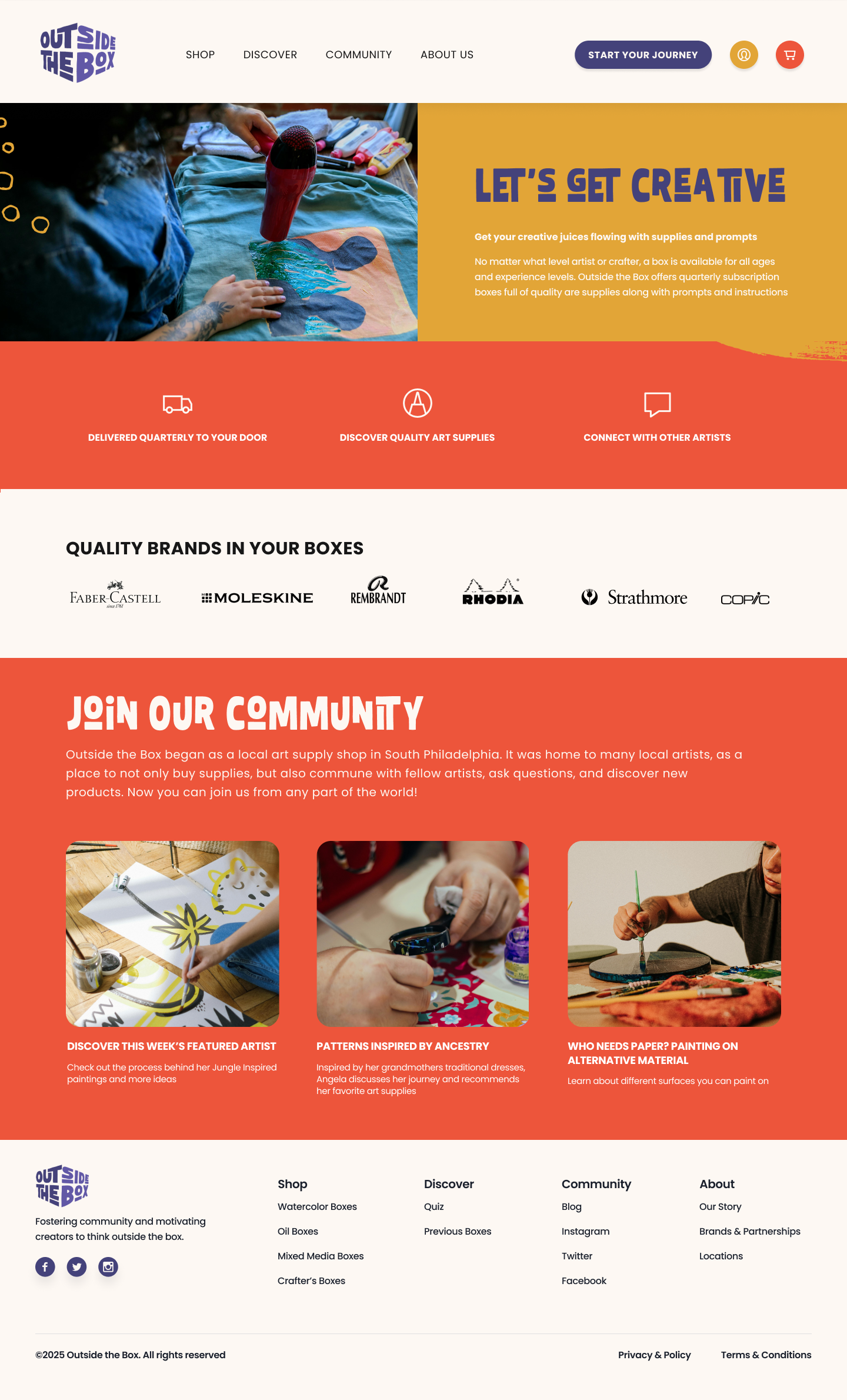
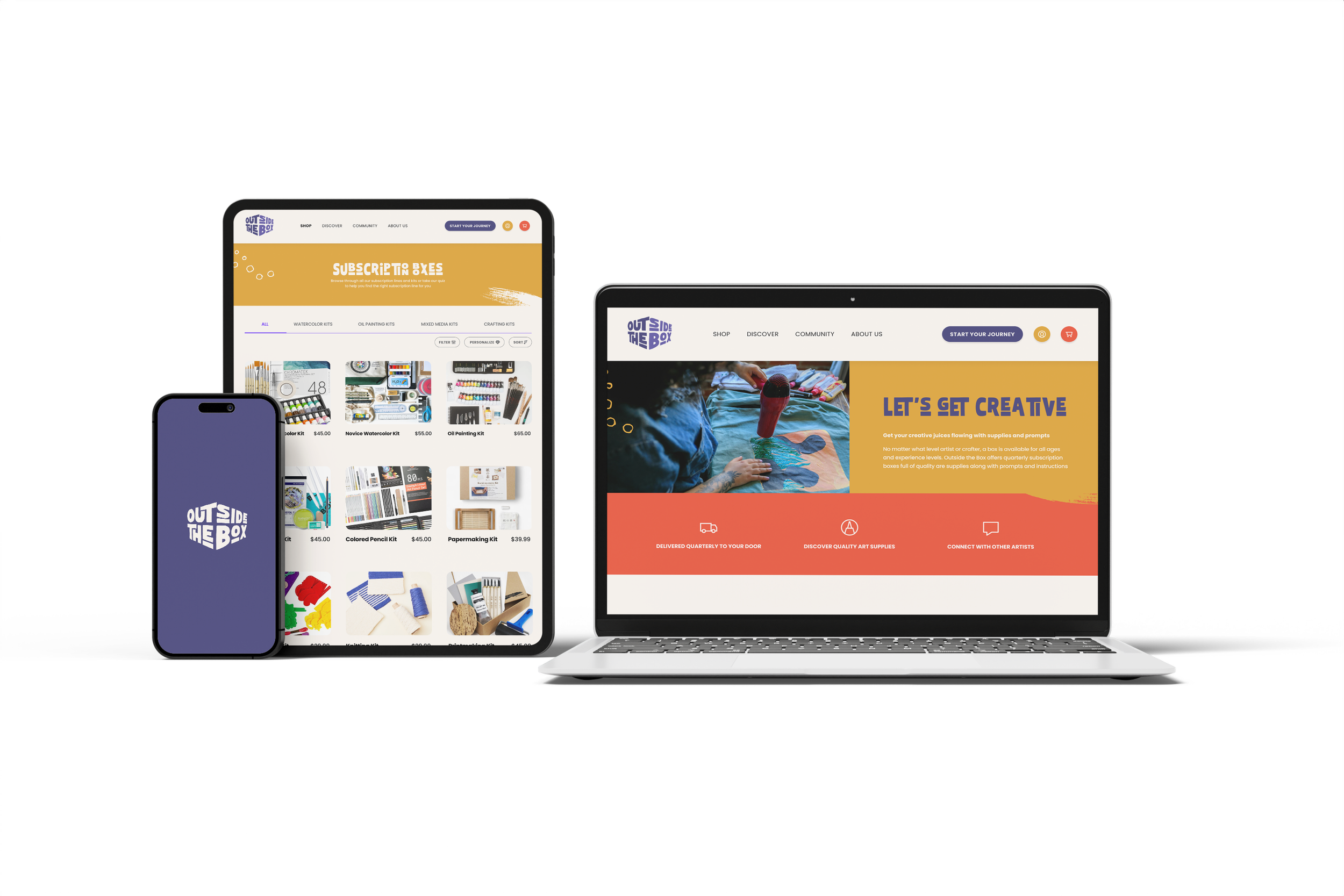
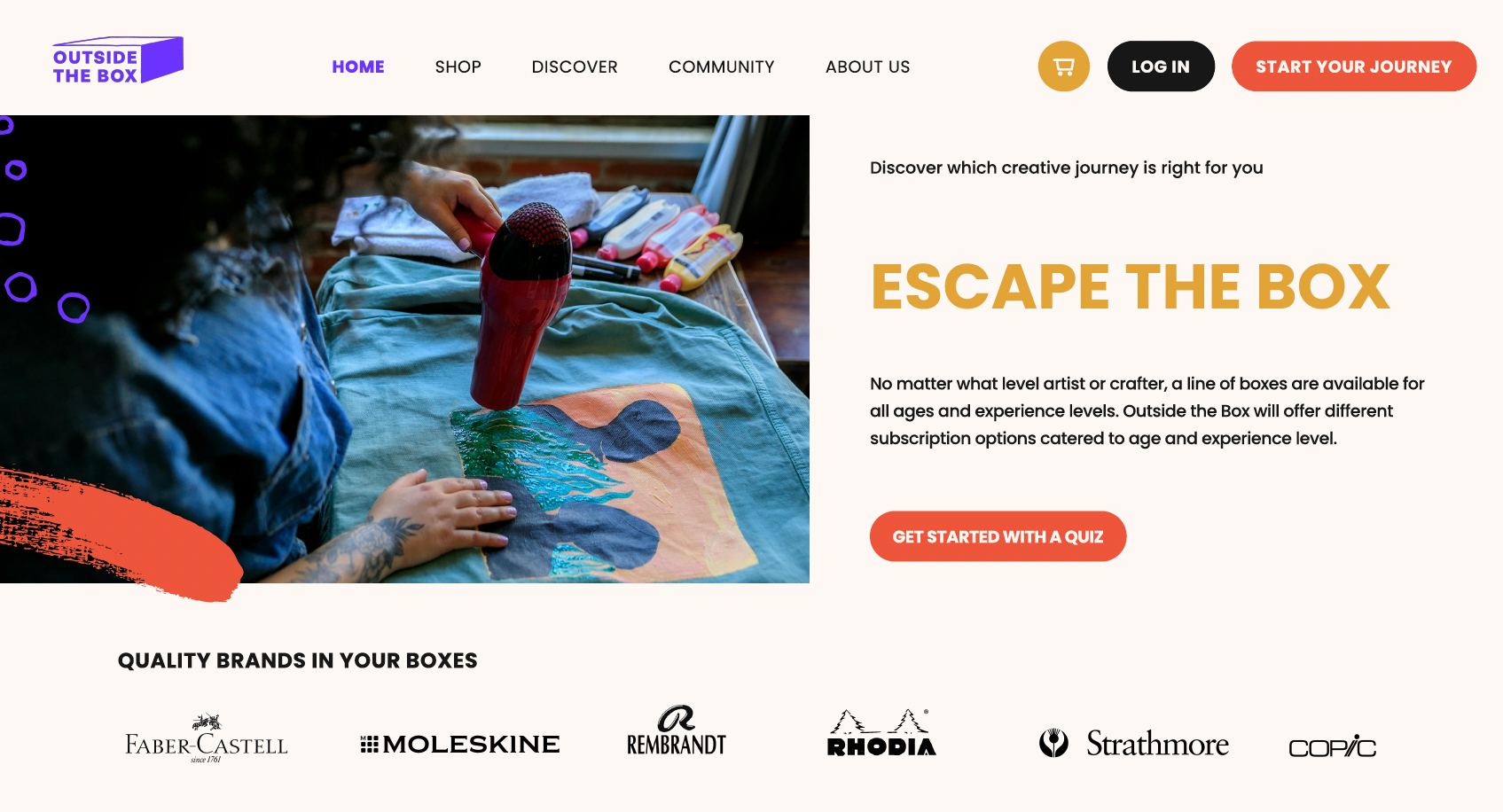
Homepage
The homepage includes a main navigation that contains a cart icon/button, a profile icon/button, and a quiz prompt for new customers. Following the main navigation is a banner with a photo showcasing an artist. To the right of the banner is an introduction for Outside the Box and the subscription service offered. Icons with subtitles are placed beneath the banner for further clarification on the service offered and how it works. Art supply brands are featured beneath it. Following is a community page with featured blog posts for artists to connect and see others’ work. Lastly is a footer section which includes social media links, privacy & policy, terms & conditions, and sitemap.
Usability Testing
Goals of Evaluation
• Get data from users about the site
• Measure user success with tasks
• Discover user obstacles in using the site
• Find ways to improve the usability of the site
• Ensure that the subscription process is clear
Evaluation Approach
The type of evaluation used was an observation approach on five selected users. The users were asked to share their first impressions of the home page. Following this, they were asked to perform the following tasks:
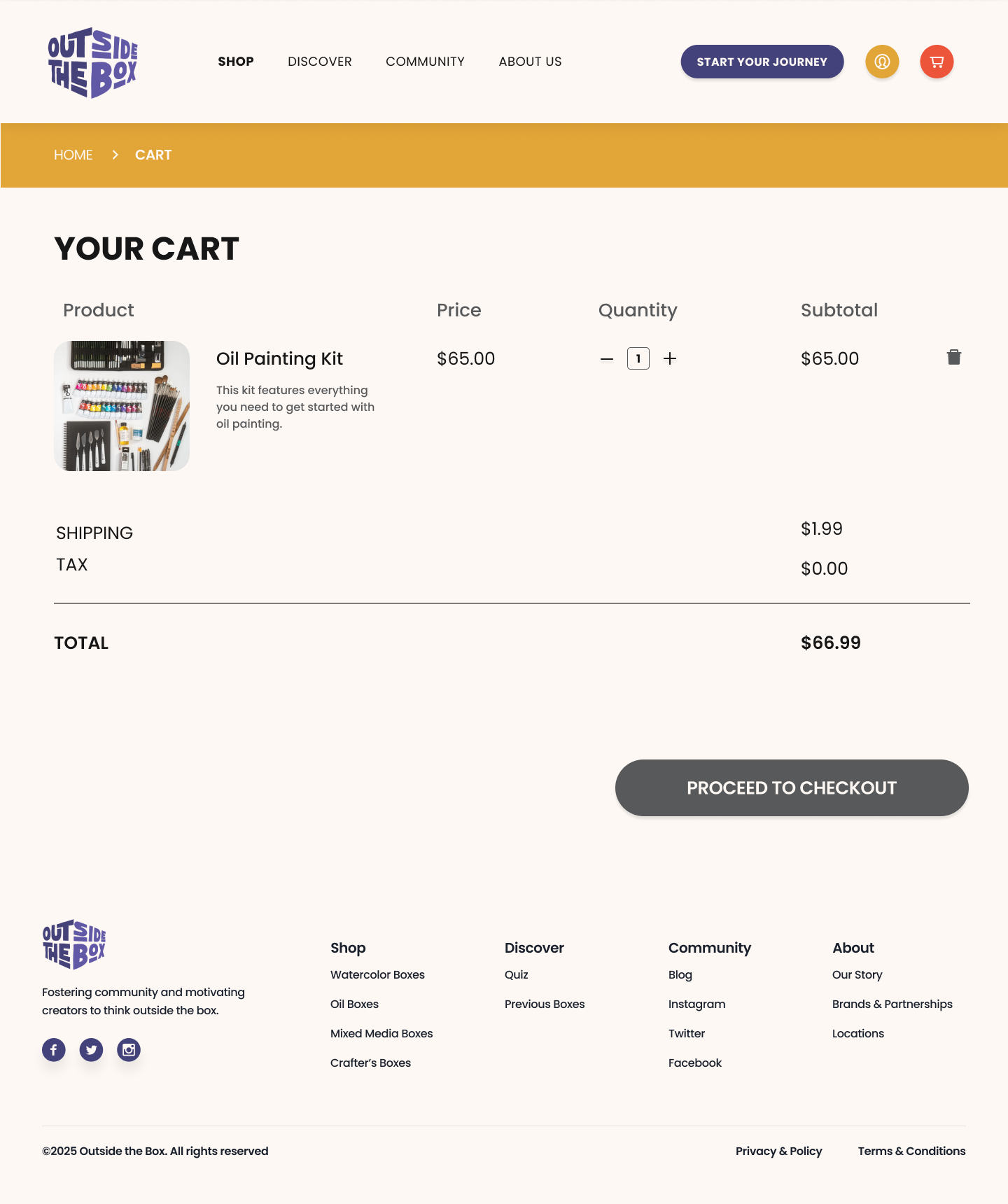
1. Find the Oil Painting Kit
2. Add Oil Painting Kit to cart
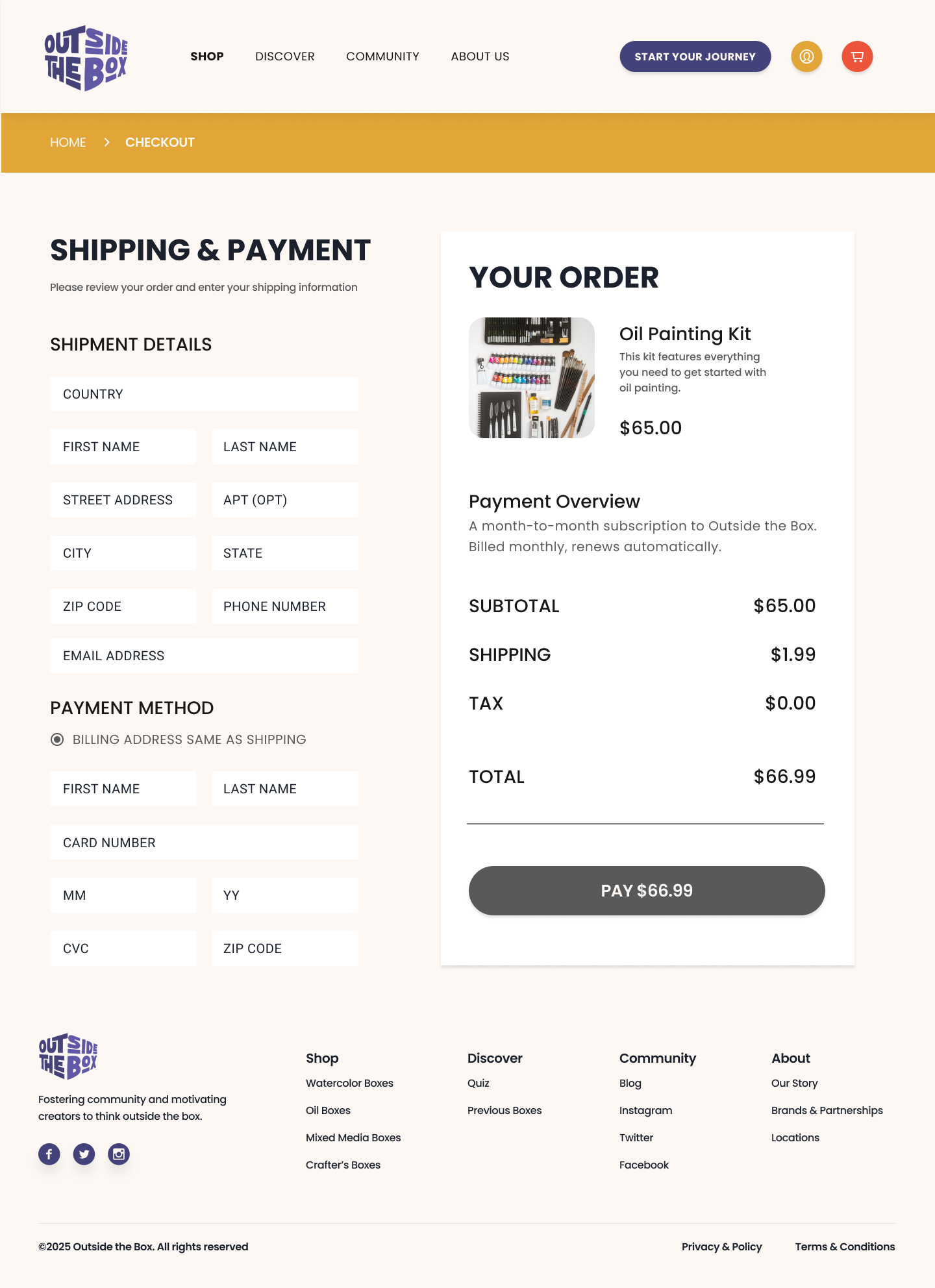
3. Proceed to checkout
After conducting an observation approach, an interview was conducted. Users were asked the following questions:
1. Was it clear that by purchasing a box, you are subscribing to a service?
2. How secure do you feel about purchasing a box?
3. After using the site, how likely would you be to try out the service?
Very likely/Likely/Neutral/Unlikely/Very Unlikely
4. Please elaborate on your answer to question 3.
5. Is there any additional feedback you’d like to share?
Frequent Problems Found
• The majority of users were unclear about the subscription service
• Most users had concerns about subscribing
• Users wished they could try before committing to the service
• Most users did not understand the subscription concept and service
Solutions
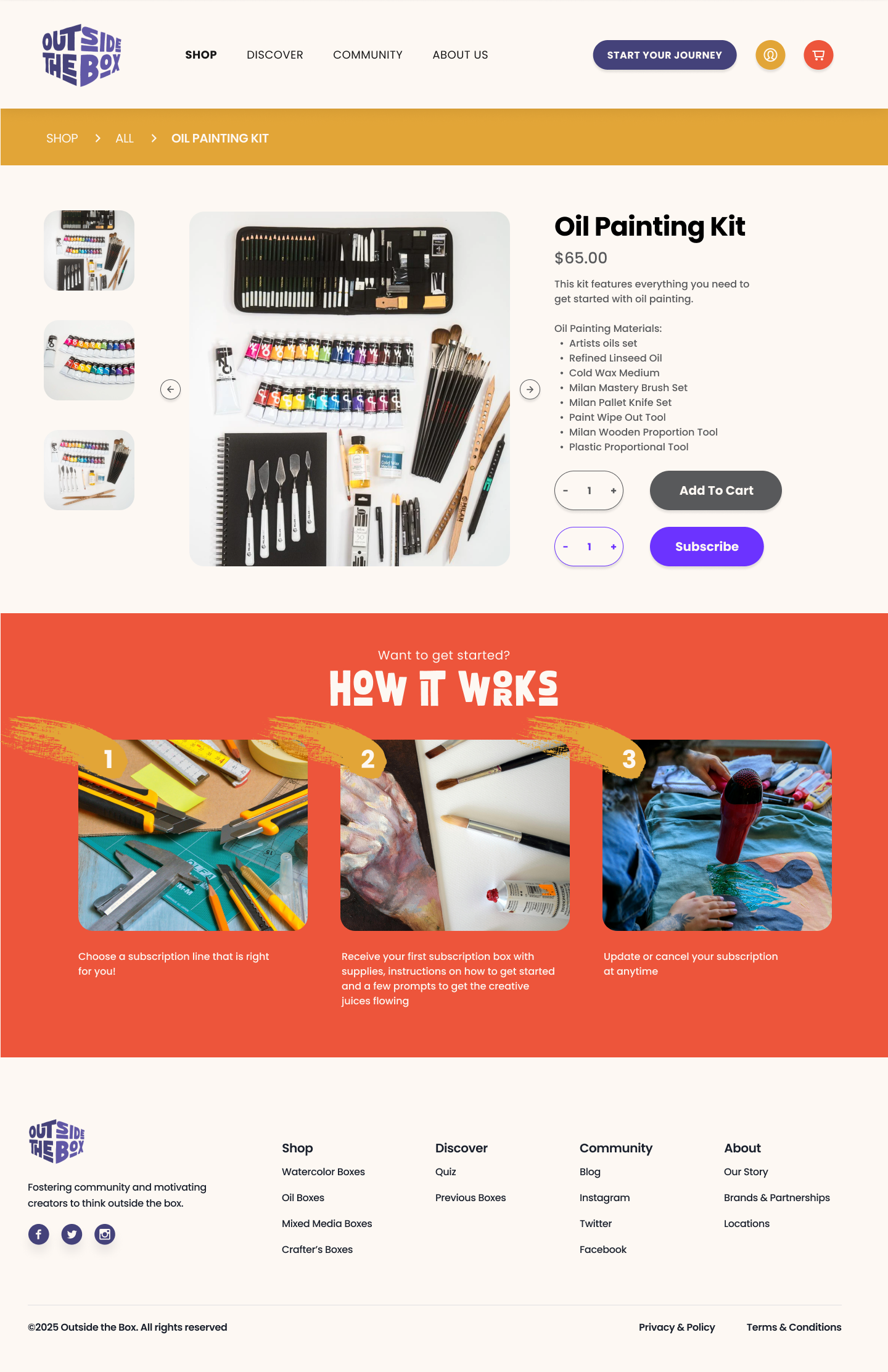
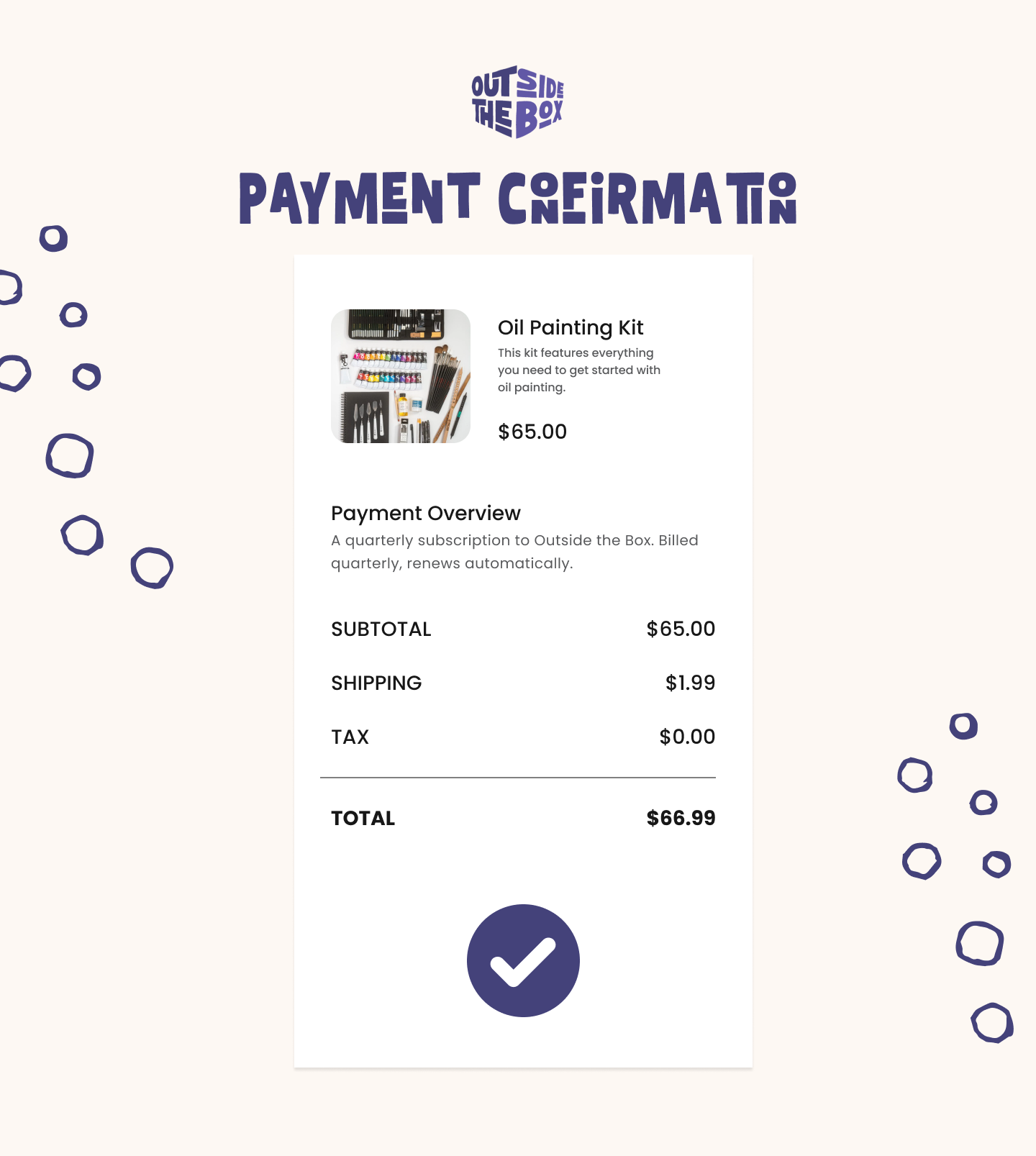
• Understanding the importance of affordances, iconography was implemented
• Both add to cart as a subscription or a one-time purchase option designed
Previous Design
The above image shows the homepage, which relies on vague introductory copy.
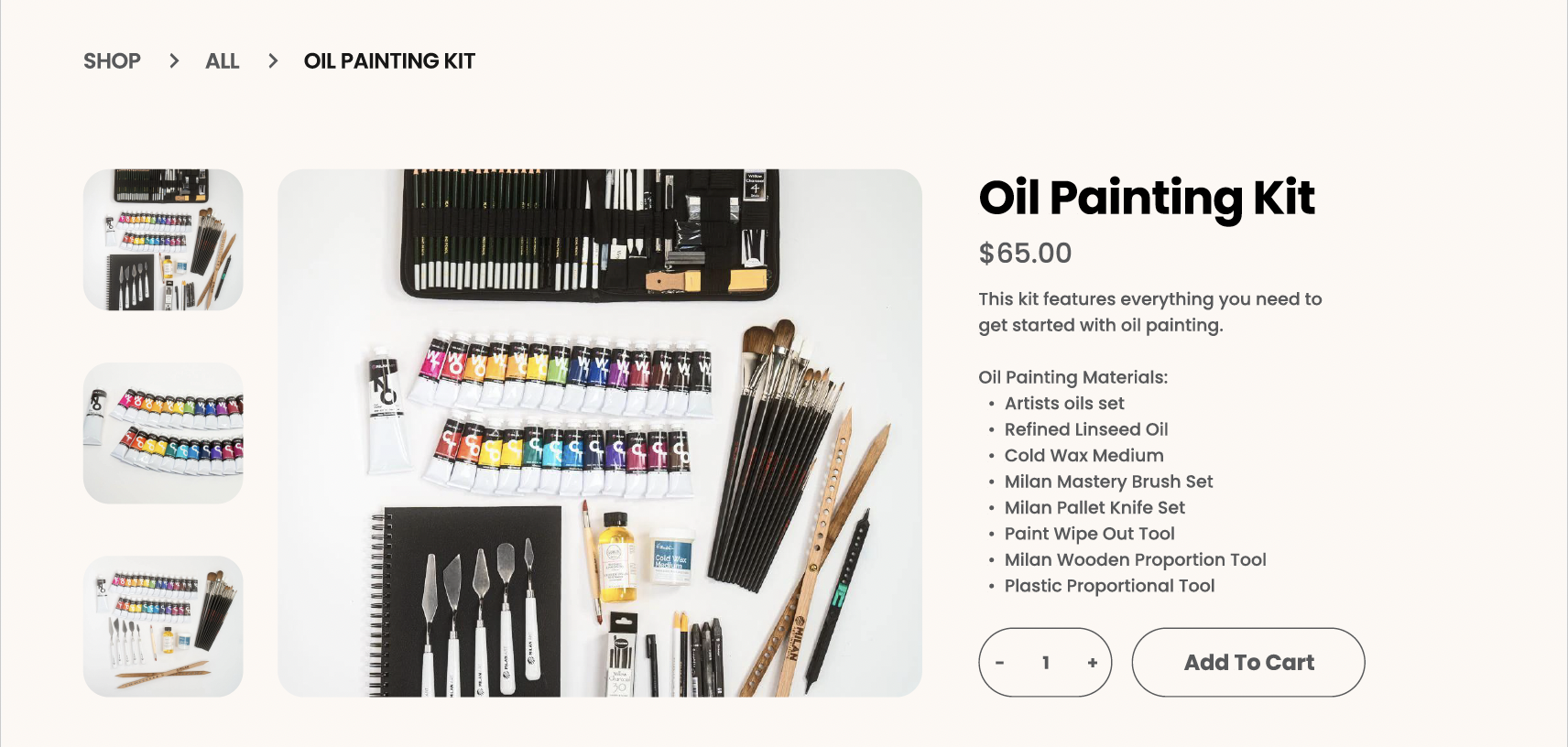
The above image is a previous design of the product page, that doesn't clearly indicate the option to subscribe vs. the one-time purchase option.
Final Interface Design
Prototype